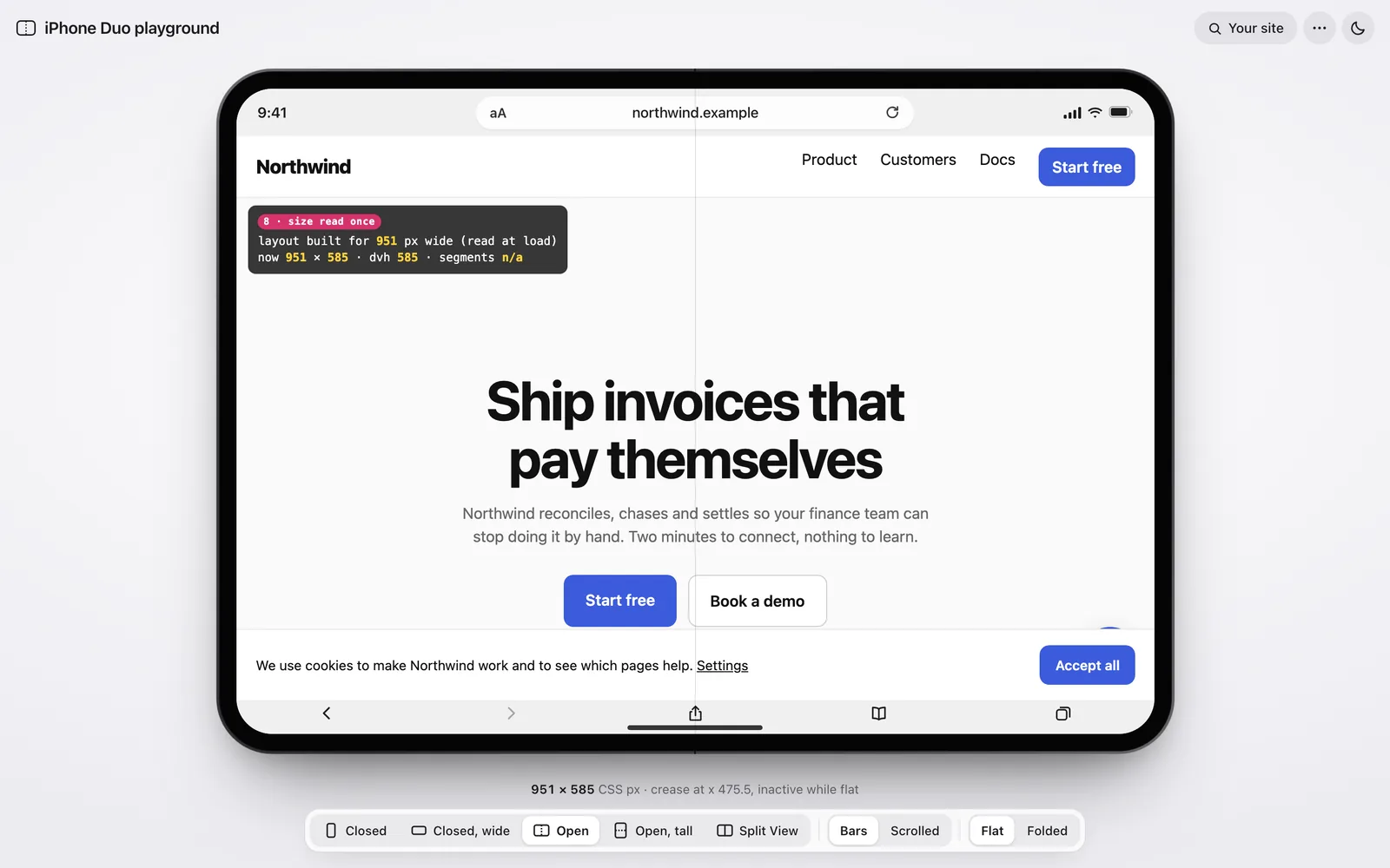
A playground that shows your website at the sizes Safari 27.1 really gives it on iPhone Duo, inside a device that opens and closes like the real one. It started as three panels of numbers. Here’s how it became one device, told mostly in pictures.
My part
Every design call, paired with Claude
Built
27 to 28 Oct 2026
Status
Live, open source (MIT)
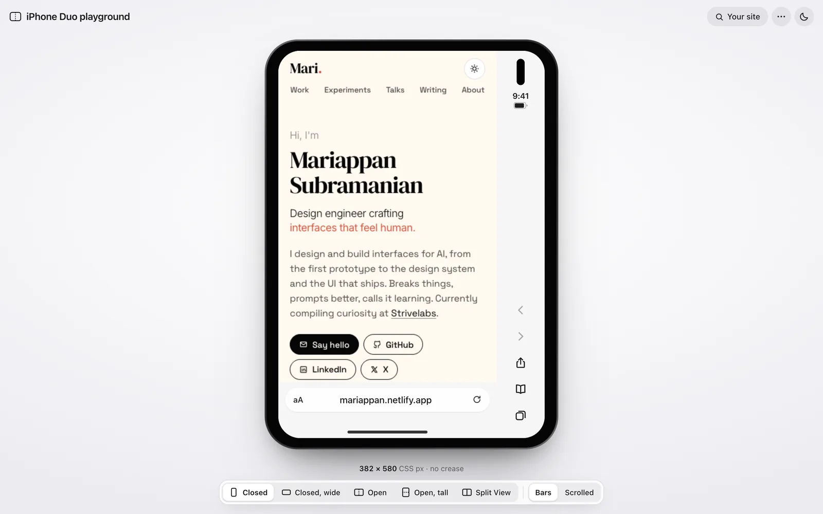
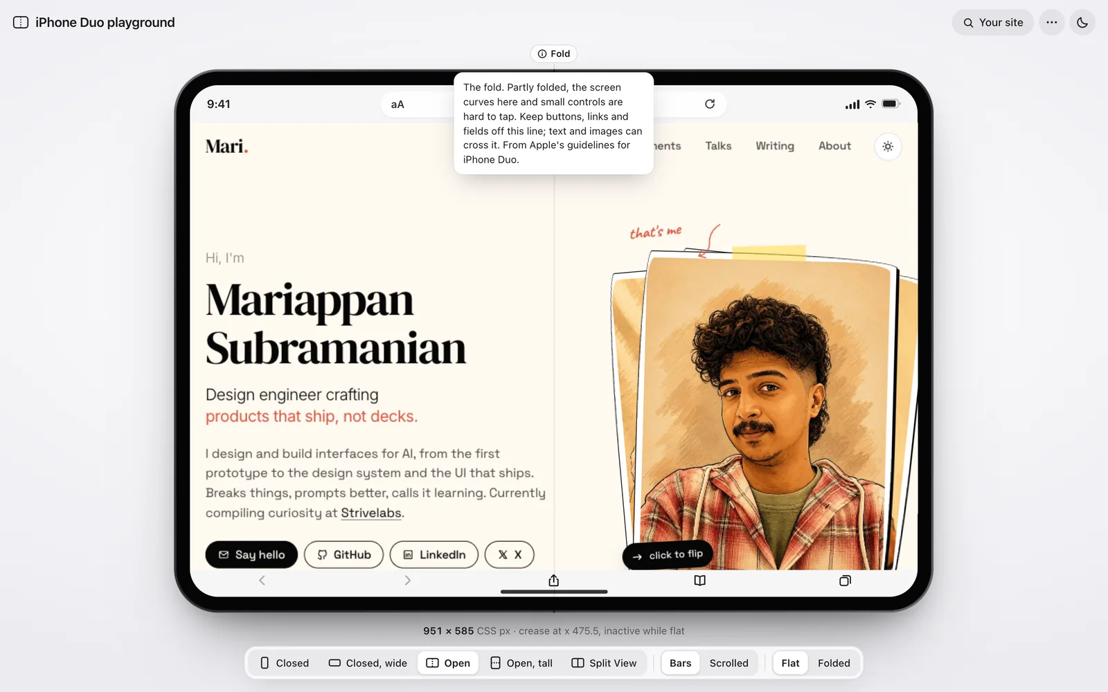
My site in the playground: open, folded, split and closed, with no reload.
01
Backstory
Five sizes, one honest device
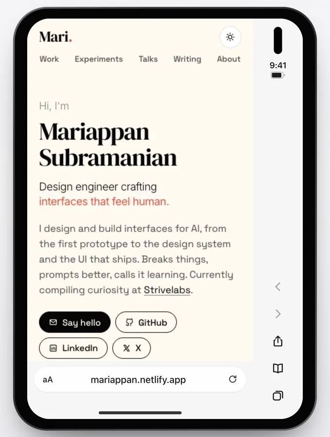
I built it as the test bench for my fit-iphone-duo skill. Online previewers divide the screen by three, but Safari keeps a column for its controls, so a page gets 382px, not 466.
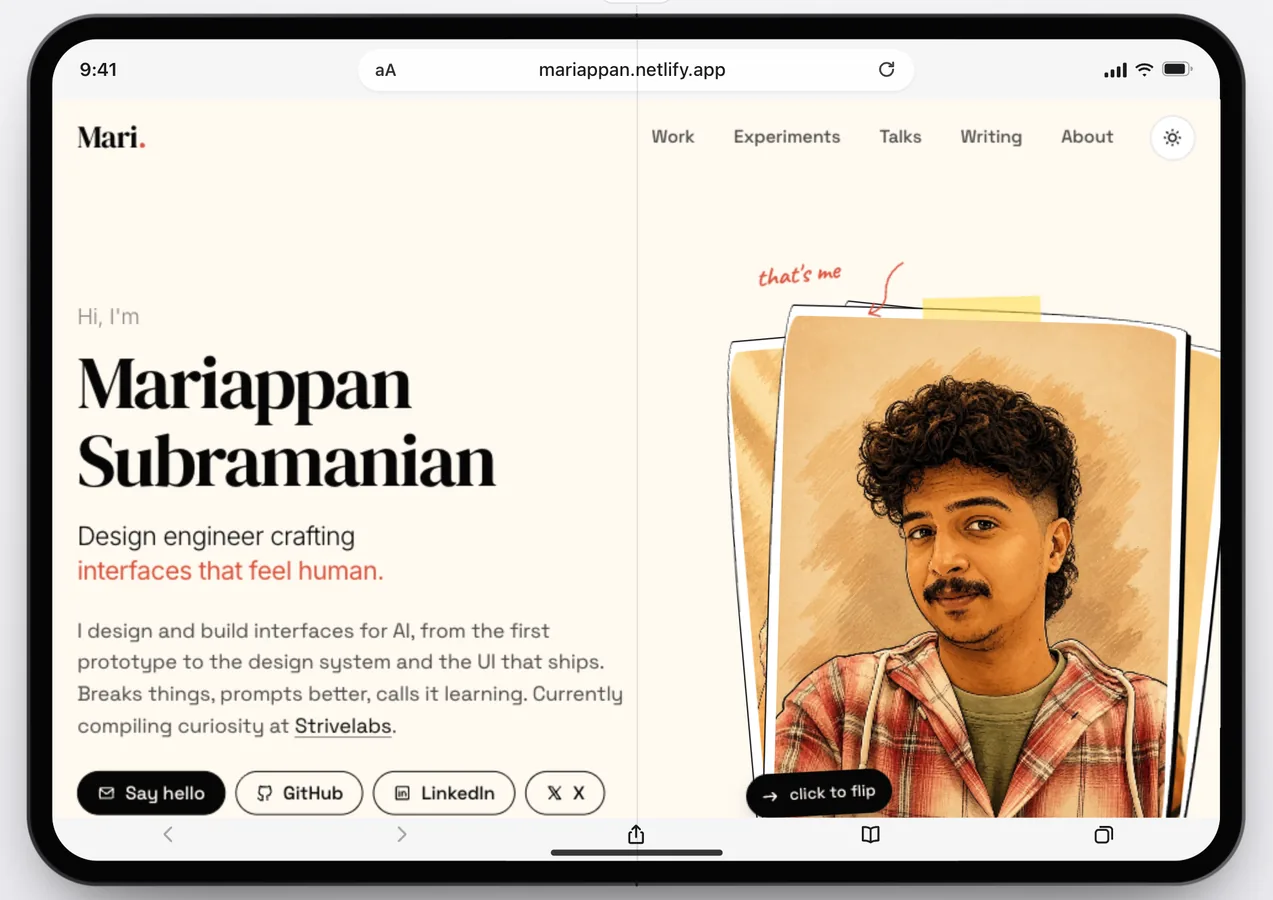
So your site loads in a frame at exactly the size Safari gives it, inside an iPhone Duo drawn from Apple’s millimetres. Media queries fire at the real width.
Closed382 × 580
Closed, wide594 × 368
Open951 × 585
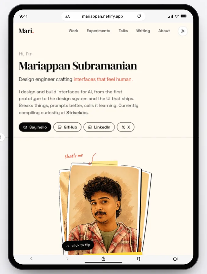
Open, tall669 × 867
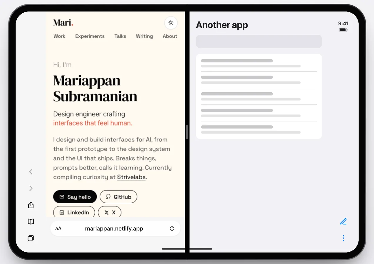
Split View385 × 571
My site at all five sizes. The two nobody else showed: 368 tall, and 385 wide.02
Design call · the stage
Give the stage to the device
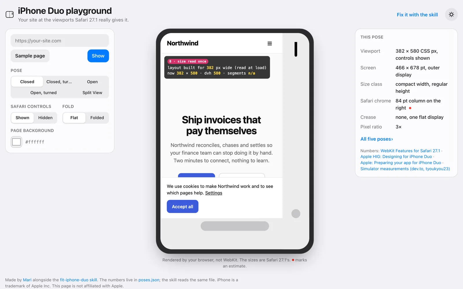
v1 was a dashboard. A form on the left, a facts table on the right, and the phone squeezed in between. Correct, and hard to look at.
So the device took the page: one header line, one caption line, one floating toolbar. The facts moved behind ⋯, and the bezel and corners came from Apple’s millimetres, so it feels like holding the phone.
Me, on v1“The actual preview is the main attraction, so it has to take the most space and attention.”
← v1Now →
‹ ›
Drag to compare. Same pose, same numbers. The page just got out of the way.03
Design call · Split View
Draw what the device does
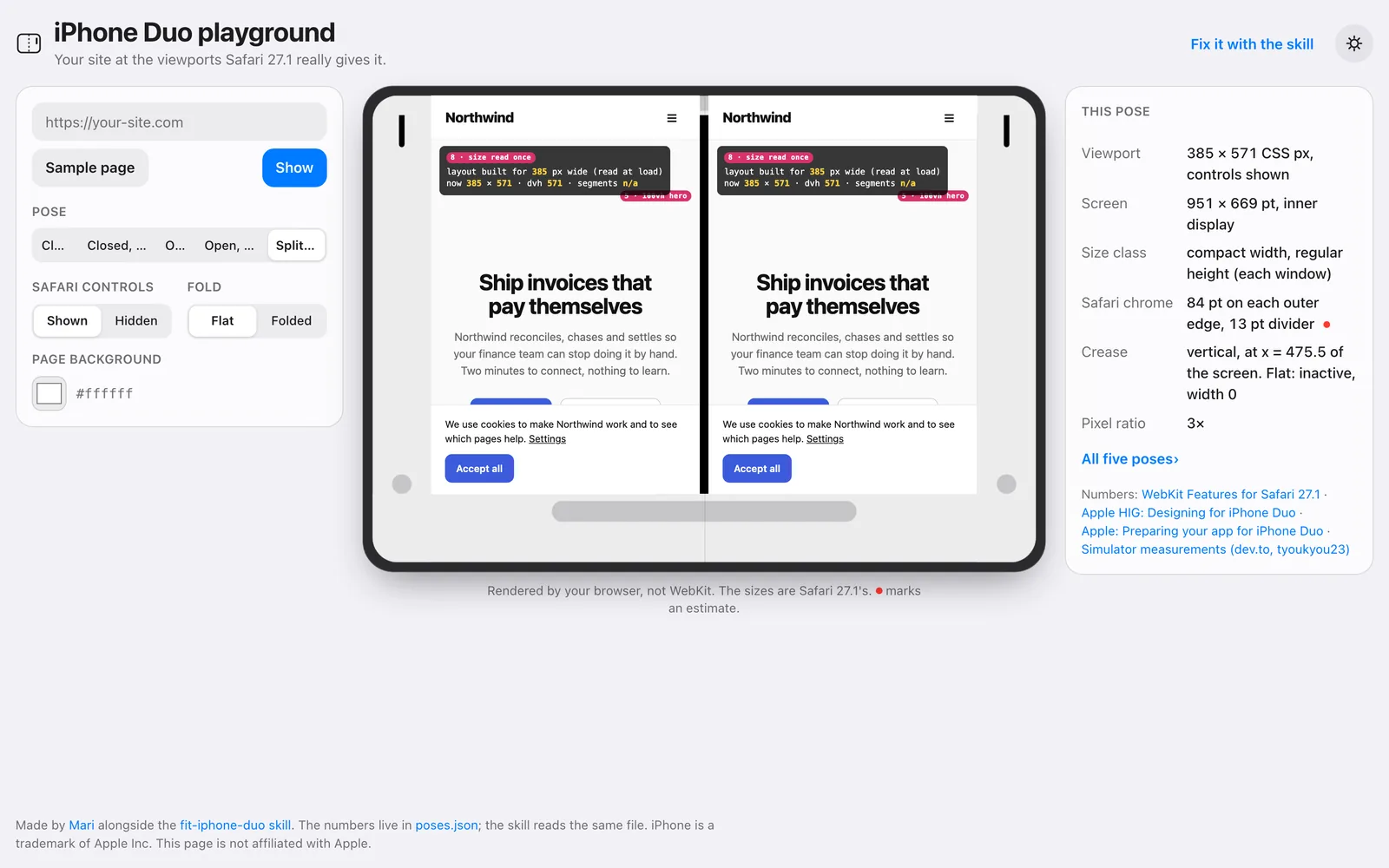
In v1, Split View showed the site twice, side by side. A shortcut, and not what the device does.
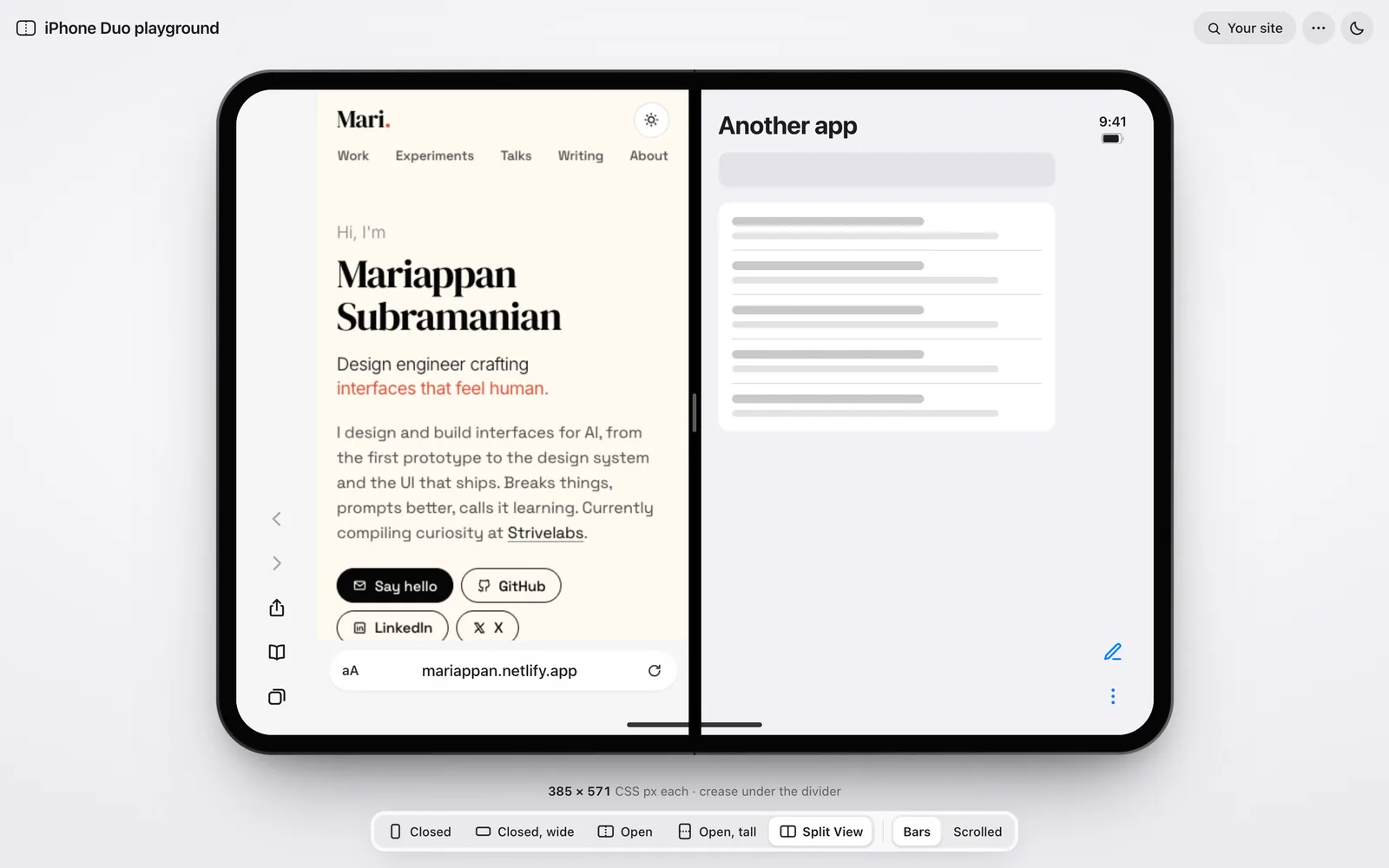
Now your site sits beside a plain “Another app”, each with its controls on its outer edge. Every pose gets Safari’s real bars, and the address field is how you load a site.
Me, on v1“Why is it showing the view 2 times in Split View? Is it how it would show on a real device?”
← v1Now →
‹ ›
Drag to compare. Your site, and whatever else you had open.04
Design call · hints
Explain on demand
A probe box and red chips like “size read once” sat on the screen. Useful, but on top of the page you came to see.
So the explanation moved outside: a small Fold marker at the crease that opens on hover, focus or tap. The fake sample became Fold Notes, a real page that follows its own advice, down to a notice that actually dismisses.
Me, on the probe“Looks ugly here. Make it like an info pointer and reveal it on interaction.”
← Round 02Now →
‹ ›
Drag to compare. Apple’s rule for the fold, one hover away.05
Motion · the fold
Fold like glass, not a cut
Only the cover half swings on the hinge, as frosted glass in CSS 3D, borrowing from a Three.js reference without the dependency. Underneath, your page resizes without a reload, through the in-between size Safari reports mid-fold.
Then, round by round: slower, softer at both ends, clear glass so your page shows through, and a close that settles onto the closed phone instead of cutting to it.
Me, round 08“It should be slow, as someone would close or open a real device, not damaging the screen.”
Open, then close. The glass sharpens as the cover lands.
Round 04the first swing
open760 ms
close640 ms
Round 05“It’s too fast”
open1150 ms
close980 ms
Round 08“slow, as on a real device”
open1640 ms
close1920 ms
Easing, start to land
smoothstep · round 04
smootherstep · round 05
+ a longer landing · round 08
no jolt at either end
Slower each round, and softer where it starts and lands.06
Motion · between poses
Fold only what folds
A book fold turns a tall closed phone into a wide open one, and a wide one into a tall one. Forcing a fold between the other pairs looked wrong.
So each pair gets its own move: fold, turn, morph or swap. And the new page only fades in once it has settled at its size, so it never arrives on a blank white screen.
Me, round 09“It’s weird, as both are different orientations. Ideally we should fade smoothly.”
240 + 1400 ms open · 1500 + 420 close
Fold
The cover swings on the hinge
Closed⇄Open
Closed⇄Split View
Closed, wide⇄Open, tall
tall opens wide, wide opens tall
640 ms turn + 300 ms fade
Turn
A quarter turn, then the new layout fades in
Closed⇄Closed, wide
Open⇄Open, tall
200 + 720 + 420 ms
Morph
Fade out, the frame flows, fade in
Closed⇄Open, tall
Closed, wide⇄Open
Closed, wide⇄Split View
200 + 420 ms
Swap
Same frame, the screen cross-fades
Open⇄Split View
Fold only what folds. Everything else gets a move of its own.
Turn, morph, turn, morph. Each one runs back from wherever it is.07
Nothing applied blindly. Each idea was measured or tried first, then kept only if it added something without changing the feel.
The toolbar making room, the thumb sliding, the theme cross-fading.
The toolbar makes room
Fold appears only where there’s a crease. The groups now slide over for it, instead of jumping 66px and moving Open out from under the pointer.
One thumb that slides
The selected segment is a clipped copy of the row, so the thumb, colour and bold label move as one, and no text shifts.
Feedback on press
Buttons press to 0.97 and segments dim the moment they’re touched. The choice still commits on release.
Safari’s progress line
A thin blue line runs along the address field while your site loads, as in Safari.
Reverse from anywhere
Pick the pose you came from mid-move, and the turn, morph or fold runs back from where it is. No waiting for it to finish.
Your settings, honoured
Reduce Motion keeps the fades and drops the swing. Reduce Transparency and Increase Contrast work too.
Left out, on purpose
Springs for the fold
Drag to fold
Animated size numbers
Press-scale on Safari’s own buttons
Ease-in exits
08
Under the hood
Judge motion in frames
Motion is easy to misjudge at full speed. So every change was checked in exact frames, on a paused clock. Twice, a frame that looked finished was the capture clock running on, not the animation.
Measure, then fix. On the GPU the fold, turn and morph hold 60 fps, so a jank seen in software rendering wasn’t real, and will-change tried as a fix made closing worse. One bug was real: Chromium drew a notice as a blank card after folding to Split View. Giving the page its own layer fixed it.
Round 05, frame by frame: turn, turn back, open, Split View and close.09
What dried
What the frames taught me
MissShowed my site twice in Split View, as a shortcut.
LessonDraw what the device does, even the dull app next door. A previewer only earns trust by being true.
MissPut the explanation on the screen, over the page.
LessonExplain on demand. The page is what people came to see.
MissFaded the whole screen between poses. Black glass flashed through.
LessonFade the contents, never the screen. The screen holds the page’s colour.
MissTrusted frames that looked finished. It was the capture clock running on.
LessonFreeze the clock before you judge motion, and measure before you fix it.
A previewer that cuts between sizes shows you sizes. One that folds shows you what your page goes through.
 Closed
382 × 580
 Closed, wide
594 × 368
 Open
951 × 585
 Open, tall
669 × 867
 Split View
385 × 571