All work

Strivelabs · Design engineer · 2024 → now

Strive’s design ecosystem

How design found a common ground at Strive: a theme on shadcn, two shared packages, Storybook, and a design system doc written for people and coding agents alike. Nobody asked for it. A few problems kept me restless, so I wrote things down and kept going, with the designers I paired with along the way.

Role
Design engineer · design systems
Team
With our designers, across each pivot
Status
Powers the platform, with live customers
Link
strivelabs.ai

At a glance

The problem

We moved fast: micro SaaS apps, then agents, then a marketing OS. A working v1 usually came first, and visual design later. But we couldn’t afford to feel like anything less on experience, and how we design wasn’t written down anywhere.

My part

  • The base. A theme on shadcn/ui, modular Tailwind presets and a reason for every choice, in use since 2024.
  • The packages. @strivelabs/ui-core and @strivelabs/ui-blocks, with a Storybook playground for developers.
  • The doc. One source of truth for people and coding agents, with the agents’ context generated from code.
  • The Figma file. Generated from the doc and the registry, so it can be regenerated just as fast.

Our designer wrote the first draft of the doc. I polished it for people and for agents.

Shipped

The packages power the whole platform client today, with live customers. The doc, Storybook and Figma give the team, and their coding agents, one place to start.

Storybook Design system Aa llms.txt 1 → DESIGN.md 2 → index.md 3 4 → tokens.json 5 for Claude Code, Cursor and friends @strivelabs/ui-blocks @strivelabs/ui-core

Backstory

Write it down before the wild ride

  • The plan was a few AI micro SaaS apps on different marketplaces and a website, with a platform to come. We had a well thought-through logo, and not much else written down.
  • So before the quick prototypes, I wrote down my base choices: font, colours, icons and a component library. Nothing new, just sure. The Storybook TODO at the end was the long game.
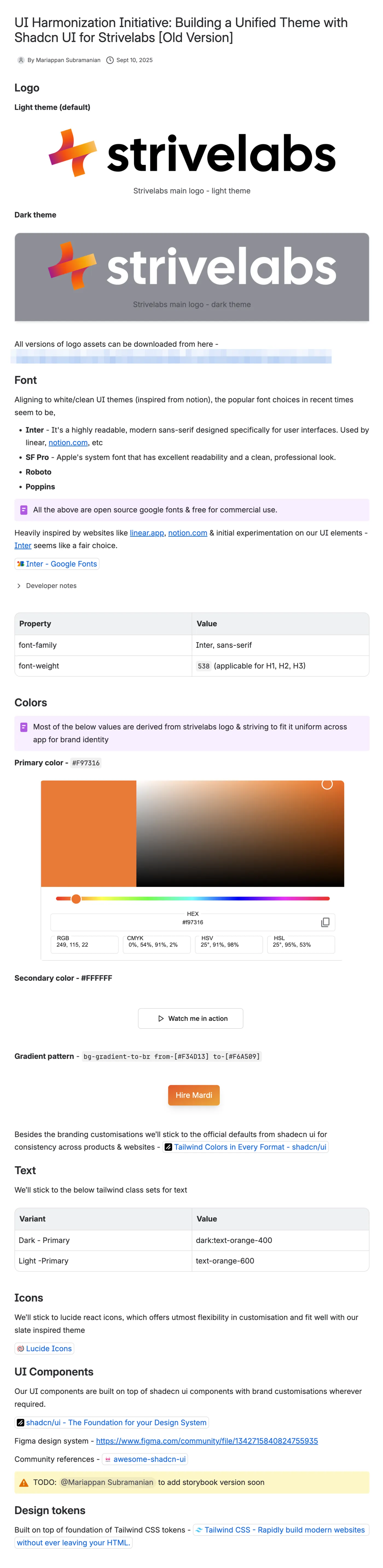
The real doc, UI Harmonization Initiative: building a unified theme with shadcn UI for Strivelabs. It covers the logo in light and dark themes, Inter as the font with weight 538 for headings, F97316 as the primary colour and white as the secondary, an orange gradient, Tailwind text classes, lucide-react icons, shadcn/ui components with brand customisations and a Figma community link, a TODO to add a Storybook version soon, and Tailwind CSS tokens.
The real thing: my base choices, in use since 2024.

Design call · base

Borrow the components, own the tokens

  • We were building towards a platform, so everything had to be modular: components, tokens and layouts.
  • So no component library of our own yet. We themed shadcn/ui, standard and widely used, to Strive, with modular Tailwind presets from the start. Set up for the long term, build only what today needs.
Every choice needs a why, or it doesn’t go in.

Foundations

Two packages, one playground

  • Then came the agents: a marketing assistant, an engineering partner in Slack and more. I gathered the patterns into @strivelabs/ui-core for the foundations, and @strivelabs/ui-blocks for bigger blocks.
  • Not a public library. Just everything in one place, so the next use case could pick it up, with a Storybook playground for developers to see what exists and build on their own.
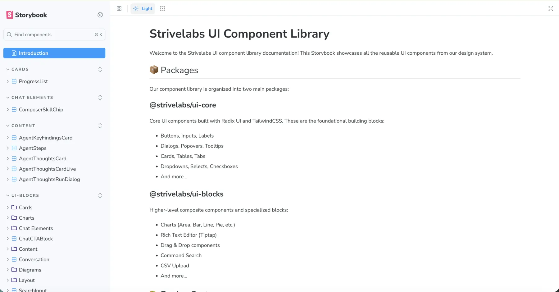
Our Storybook: the component list on the left, with cards, chat elements, content and ui-blocks groups, and the introduction page for the Strivelabs UI component library, which describes the two packages. ui-core holds core components built with Radix UI and Tailwind CSS, like buttons, inputs, dialogs, cards, tables and dropdowns. ui-blocks holds higher-level blocks like charts, a rich text editor, drag and drop, command search and CSV upload.
The real thing: our Storybook, with both packages.

There’s more behind these two packages: the split, why we never published them, and the bundler swap. The full story is in the blog

Where it hurt

One button, three versions

  • From micro SaaS apps to agents to a marketing OS, I worked with a different designer on each pivot, and each experiment needed its own look.
  • So the registry and the presets outgrew themselves. I kept versions of the same component alive for each one, and Storybook got confusing.
Every pivot left a version behind.

Design call · scope

A knowledge base, not a showcase

  • We had no plans for a builder experience anytime soon, so there was no reason to publish any of it.
  • So I paired with our designer on something minimal: a knowledge base for the team and their coding agents, mess included, to see how alarming it was.
See the mess before you fix it.

Common ground

One source, three readers

  • Our designer did a good first pass: a Claude artifact documenting what was in our codebase. I polished it into one source of truth: foundations, patterns, components, and links to Storybook, Figma and a cheat sheet.
  • Now designers use the doc, Figma or Storybook, and developers use the playground. Coding agents read the doc as context, because we can’t really leave the agents out.
The real thing: a quick tour of the doc.

For agents

Generated, not hand-kept

  • Agents get their own way in: llms.txt, a tiny router that points to DESIGN.md, a page per component, and JSON catalogues of components, patterns and tokens.
  • Almost none of it is written by hand. A script builds it from the component source, the Storybook stories and the platform token CSS. Change a component, run gen-ai-context, commit the result.
Generated from the code, so it can’t drift from the code.

Design call · Figma

Sync it when it hurts

  • Nobody asked for any of this, so every call weighed cost against impact. Does Figma still make sense when we design in code? Our designer’s answer: yes, as a playground for quick, specific changes.
  • Based on that, we generated one version in Figma, straight from code: the doc and the registry, through Claude and the Figma MCP. The sync isn’t automated end to end yet. It regenerates just as fast.
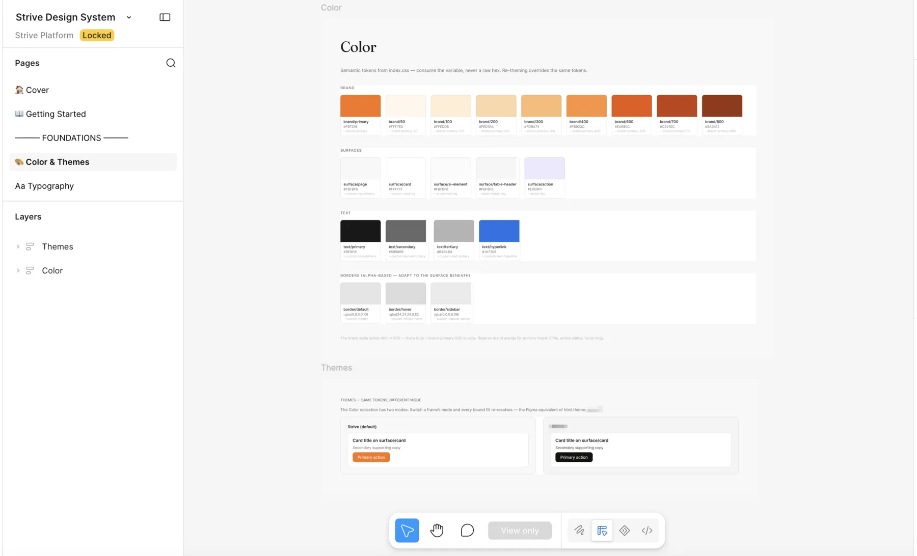
The Strive Design System file in Figma, on the Color and Themes page: brand orange swatches from brand 50 to brand 800, surface, text and border tokens, each named after its code token, and a themes section showing the same card with its primary action in two modes.
The real thing: colour and themes, generated from the doc.

What changed

Audits, then a cleanup

  • Writing it all down worked like an audit: where we were inconsistent, what to build, and what not to reinvent.
  • So we unified pages that used to look different from each other, and cleaned up a big chunk of tokens. Agents now have fewer variants to choose between.
Less to choose from, for people and for agents.

Misses & lessons

What our pivots taught the system

  • MissLet each pivot add its own version of a component.

    LessonWrite down the drift early. It’s cheaper to see the mess than to guess it.

  • MissLet Storybook grow a variant per experiment.

    LessonA playground helps only when you can find the one to use.

  • MissKept the base doc for myself.

    LessonWrite it for the team, and now for the agents too.

  • MissTried to support every way of doing the same thing.

    LessonPut a hard stop. We skipped Claude Design completely, and didn’t automate the Figma sync right away.

We didn’t set out to build a design system. We kept writing things down, and one grew.

Back to all work